Brand · Design · Film · 2025–26
Parody, traded for provenance
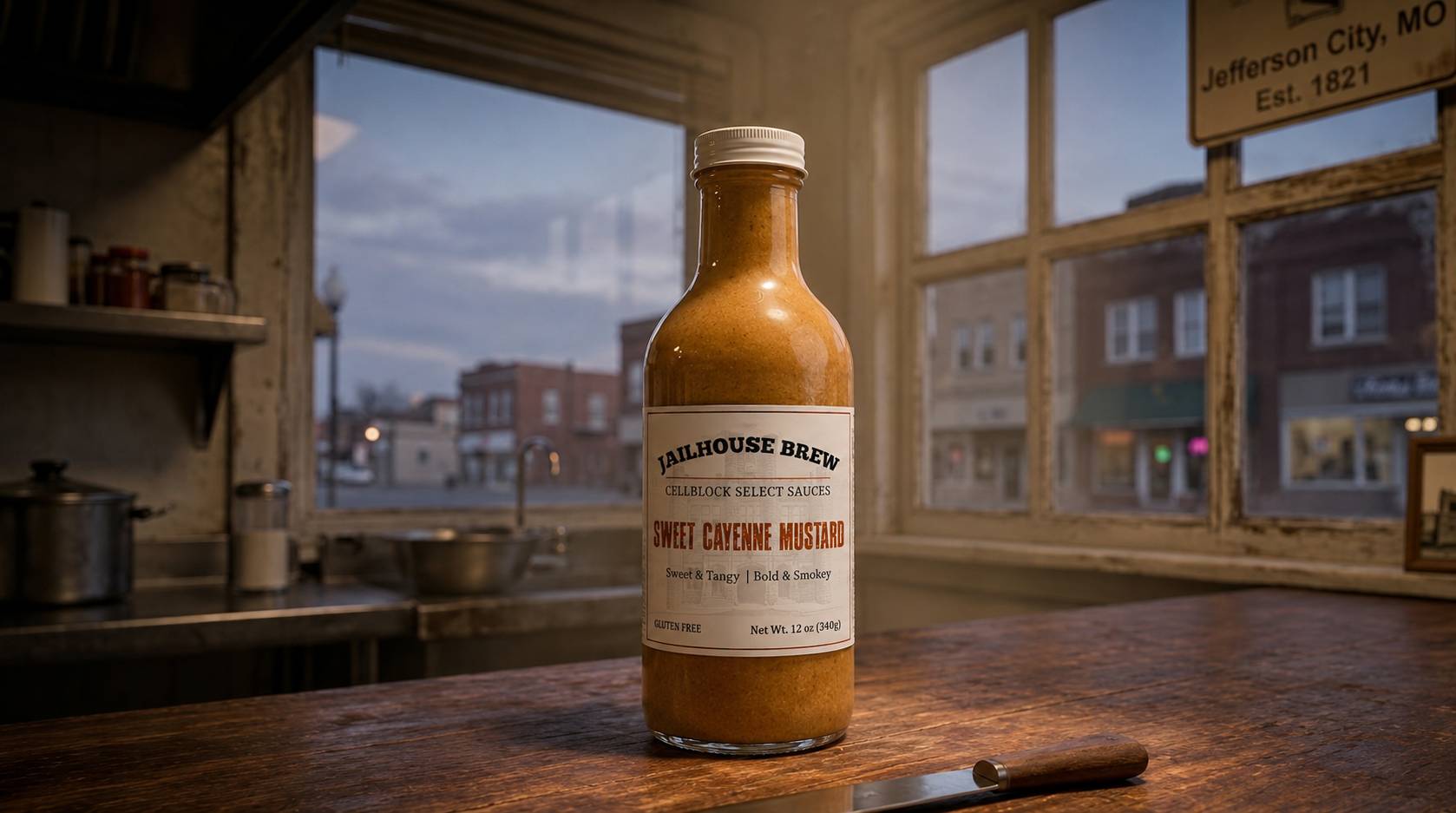
A Missouri sauce brand headed for grocery shelves needed to grow up without selling out. The move was provenance: trade the cartoon prisoner for the real penitentiary already sitting in the founder’s family story.
- Role
- Creative direction, brand, film
- Year
- 2025–26 (ongoing)
- Deliverables
- Identity, label system, packaging, CG spot
Brief
Grow up without selling out
Jailbrew is a small-batch sauce company from the same family as Spring River Cattle Company: a Missouri operation with a prison-pun name, a loyal farmers-market following, and a founder for whom the jailhouse theme isn’t a gimmick. The Missouri State Penitentiary has personal significance to him; it’s part of the brand’s actual story, not a costume it wears.
My history with the brand started before the rebrand. I produced their published commercial (full CG, built in Unreal Engine) plus other video content under the original identity. Then came the bigger question.
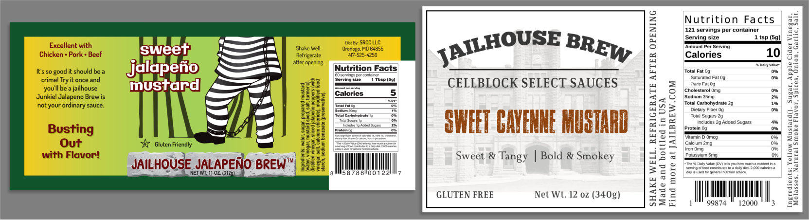
The original label was a joke told loudly: a cartoon prisoner in stripes, a lime-to-yellow gradient, bubble letters with outlines, a brick-textured wordmark, and “Busting Out with Flavor!” Every element shouting the same pun at once. It worked at a market stand, where the seller is the brand. But the company was heading for grocery shelves, and on a shelf next to grown-up condiments, loud-novelty reads gift purchase: bought once for a laugh, never repurchased.
The brief, in spirit: grow up without selling out. Keep the grin. Lose the costume.
Discovery
The theme didn’t need to be quieter. It needed to be true.
The founder’s connection to the Missouri State Penitentiary was sitting right there: a real, imposing, historic place with more character than any cartoon could invent.
That reframed the whole problem. The pun wasn’t the liability; the parody was. A brand that jokes about prison reads as novelty. A brand with an actual penitentiary in its family history reads as a brand with a story.
Strategy
Same joke, straight face
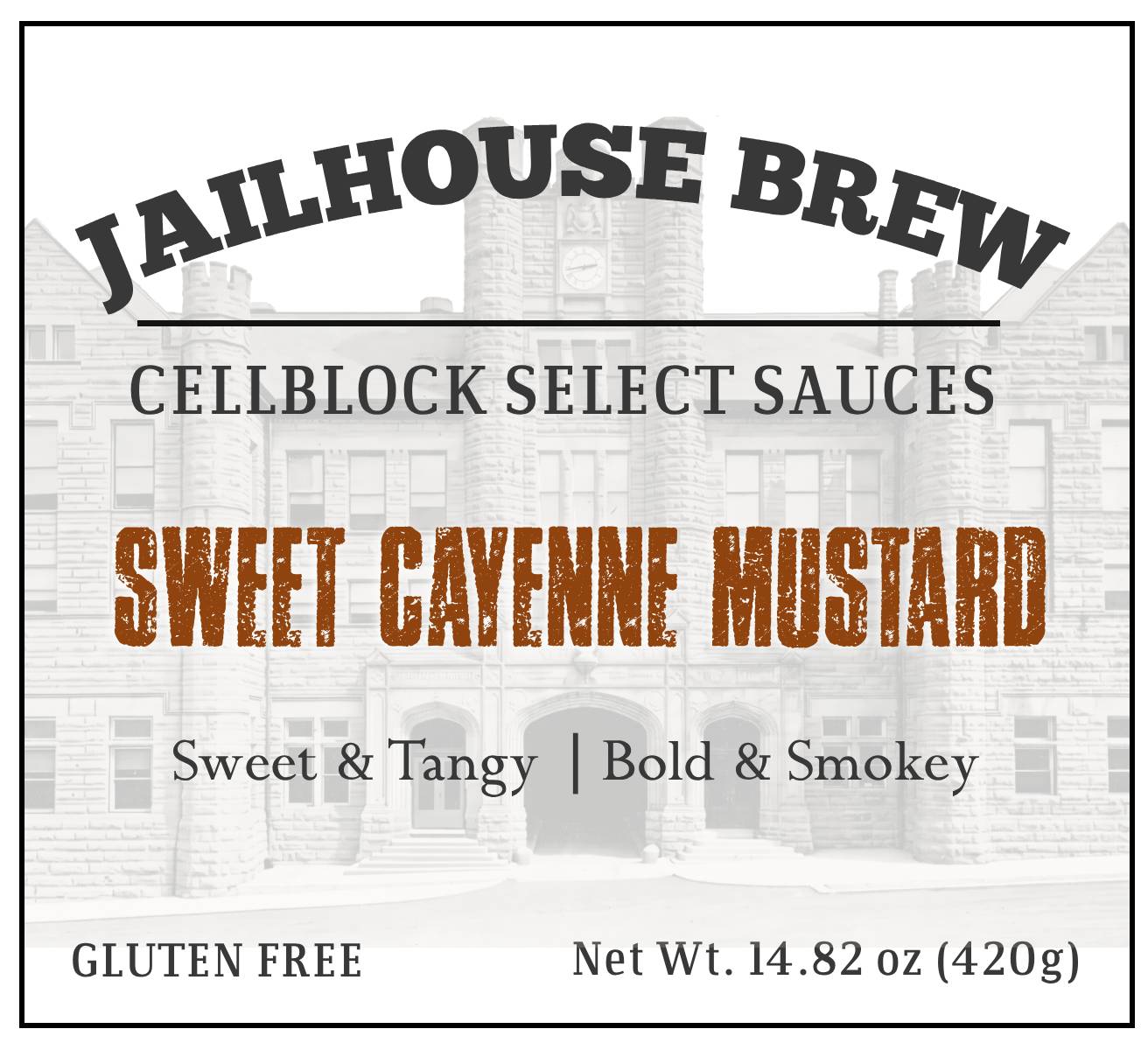
The central move: put the real penitentiary on the label, ghosted behind the type like a memory. That single substitution turns “prison-themed sauce” into “sauce with a history.”
The same joke, told with a straight face, is funnier. It’s also premium.
The work
One layout, four varieties, a line that scales
Architecture. JAILHOUSE BREW arches over the establishing line CELLBLOCK SELECT SAUCES. “Cellblock” keeps the grin; “select” quietly does the premium work.
One loud element per label. The variety name, set in distressed stamp type: the single raised voice in an otherwise composed layout.
Color codes the line. Four varieties, one layout, one stamp treatment, with the stamp’s color as the per-flavor differentiator. Sweet Cayenne Mustard launches the system; three more follow the template as production scales. That’s the difference between designing a label and designing a line: the fourth flavor is already designed before it exists.
The unglamorous craft. A properly set FDA nutrition panel, integrated barcode, wine-label-style spine copy (shake well · made in USA · JAILBREW.COM), and full press-ready production files.
The label is print-tested. At its natural four inches on the bottle, the distressed stamp type, the ghosted photograph, and the typographic hierarchy all hold exactly as they render on screen. Designing for the screen is easy; the flexo press and the arm’s-length shelf read are where label systems live or die.
Results
In bottling finalization, and the fourth sauce is already designed
The rebrand is in bottling finalization. Remaining Sweet Jalapeño stock sells through under the original label while Sweet Cayenne Mustard begins life under the new system, a deliberately staged transition that respects a small producer’s inventory reality. As bottling stabilizes, the remaining varieties roll onto the template.
Small brands with a real personality are the easiest clients to ruin. Sand off the weird and you’ve made them forgettable; leave it unstructured and they can’t leave the farmers market. The job is structural: find what’s true in the personality (a real penitentiary, a family story) and build the system around that truth.
The joke survives. The brand grows up. And the fourth sauce is already designed.